What Tamagotchi Taught Us About UI Design: Why 90s Virtual Pets Still Matter Today
Remember Tamagotchis? Those little digital pets from the late ’90s that beeped, begged for food, and sometimes… died on you?
They weren’t just toys. These pixelated blobs inside plastic eggs taught an entire generation how to interact with digital systems—without realizing it.
And here’s the kicker: many of today’s most intuitive apps still borrow lessons from those simple virtual pets.
This isn’t just tech nostalgia. It's a real masterclass in minimalist user interface design.
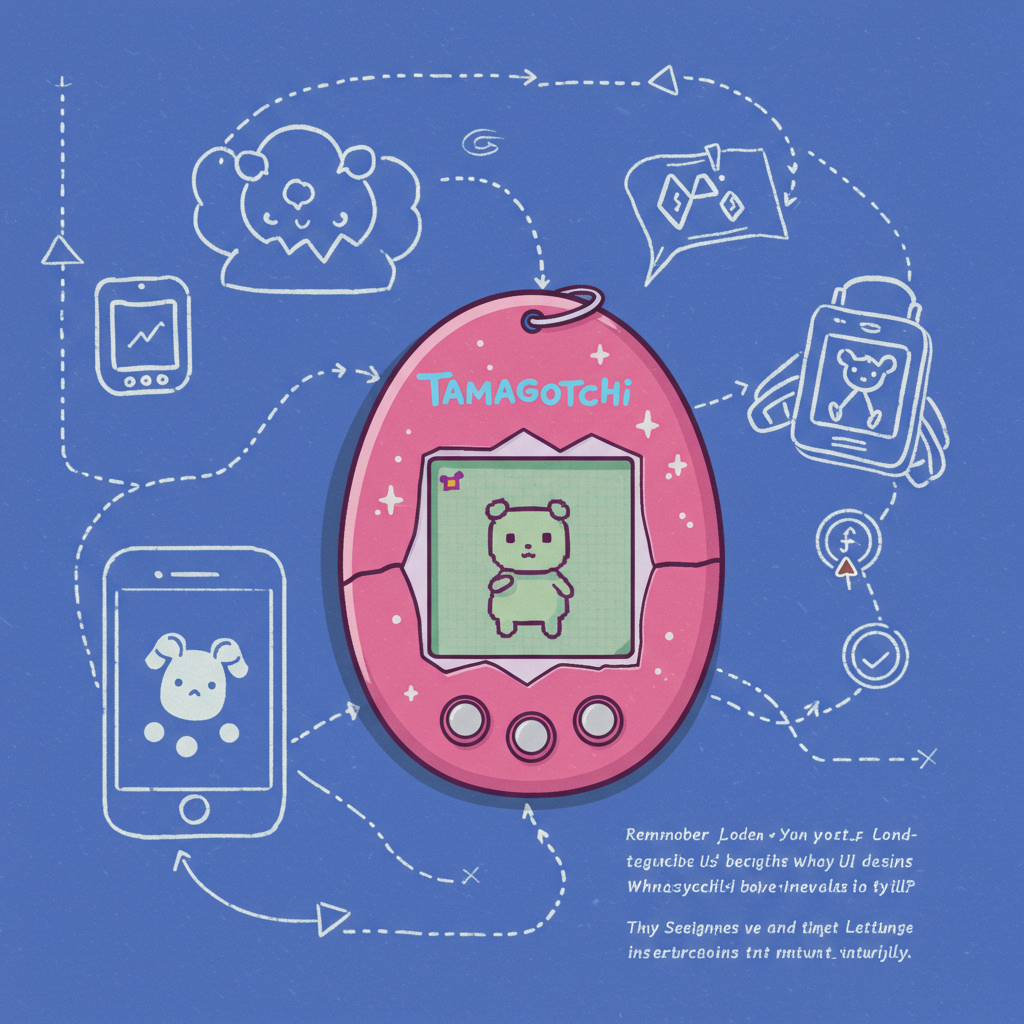
Back When Three Buttons Were Enough
Let’s start with what made a Tamagotchi so clever:
- One screen
- Three buttons (A, B, C)
- No manual
- Millions of users who figured it out immediately
That’s rare—even now.
You didn’t need a tutorial. You just pressed buttons and quickly understood how everything worked. Want to feed your pet? Press A to open the menu, B to confirm your choice, C to back out. Done.
Compare that with modern apps where you tap through five screens just to change a setting or unsubscribe from emails you never signed up for.
Tamagotchis proved something important: when design is clear and feedback is instant, people don’t need instructions—they explore naturally.
Why Nostalgic Tech Design Keeps Coming Back
Sure, part of why we love old-school devices is because they remind us of simpler times—no shame in that.
But there’s more going on here than retro vibes and neon pixels. Many designers today are rethinking how much tech we really need—and looking at older tools for answers.
Take Calmaria—a minimalist breathing app—or apps like BeReal that intentionally limit usage instead of encouraging addiction loops like endless scroll feeds (looking at you again, Instagram). Their simplicity feels refreshing because it respects our time and attention span.
That same logic powered Tamagotchis: functional constraints + emotional engagement = sticky experiences without being manipulative or overwhelming.
Five Actual UX Lessons From Your Old Digital Pet
You might be surprised by how much these little devices can still teach us about interface design today:
1️⃣ Limit Options = Clearer Choices
Three buttons forced clarity. Every action had meaning—and fewer decisions meant faster learning curves.
2️⃣ Immediate Feedback Builds Trust
When your Tamagotchi was hungry or sick—it told you right away with sounds or animations. You always knew what was happening.
3️⃣ Keep It Simple To Keep Attention
You could understand a Tamagotchi in seconds—not after watching an explainer video or reading help docs.
4️⃣ Make People Care Emotionally
People cried when their virtual pet “died.” That kind of emotional connection creates loyalty most apps only dream about.
5️⃣ Repetition Can Build Rituals
Feeding your pet daily wasn’t annoying—it became part of your routine. This sense of habit-building powers successful products today (think Duolingo).
Retro Devices Are Secret UX Textbooks
Let’s go beyond Tamagotchis for a second…
Palm Pilots nailed one-thumb navigation before smartphones did. The original Game Boy had hyper-efficient menus designed around hardware limits—but they were fast and easy every time you picked one up.
These devices weren’t flashy—but they respected people’s time and cognitive load long before those terms were trendy in product meetings.
Today we chase “clean” designs but often forget why simplicity matters: not because it's pretty—but because it's usable under pressure or distraction (like feeding Momo_69 during math class).
Minimalist Tech Is Making A Comeback—for Good Reason
We’re seeing growing interest in slow-tech movements—tools built not to grab attention but protect it:
📱 Light Phone II strips away social media altogether—just calls, texts, maps.
📝 iA Writer gives writers nothing but words—no pop-ups or formatting fluff.
🎧 Vinyl records are back too—not more convenient than streaming but way more intentional as listening experiences go.
All these ideas echo what made virtual pets strangely addictive yet healthy—they asked for attention sparingly but gave joy consistently when used right.
And honestly? That balance feels revolutionary compared to most notification-heavy platforms today trying desperately not to be closed mid-scroll.
Final Thought: Could Your App Survive With Just Three Buttons?
If you're building something new—or improving something old—it helps asking this question:
Would my product make sense if I could only use three inputs?
Because that's all the original Tamagotchi had—and somehow millions loved them anyway 🤯💡🐣
Simplicity isn’t limiting when done right—it unlocks better habits, deeper connections…and let’s face it…fewer taps between opening an app and actually doing something useful.
So next time you're stuck designing an onboarding flow no one wants to read…
Feed your inner designer some nostalgia instead.
—
👀 Keywords naturally included:
nostalgic tech design · tamagotchi UI · retro digital interfaces · minimalist app history · virtual pet UX principles · constraint-based interaction design
—
Got memories (or trauma) from raising a needy digital creature back in the day? Share yours below 👇 Let’s talk about which ancient gadgets taught us modern wisdom—and maybe even build simpler things again together.


Leave a Reply